Information Technology (IT) is seeking feedback on the upcoming Summer 2024 enhancements to the MyCourses Main Homepage. Your input is needed!
As we continue to offer online, hybrid, and hyflex courses, the MyCourses experience must be regularly reviewed to ensure that we are offering a user-friendly as well as mobile-friendly experience.
The current MyCourses Main Homepage has evolved over the last few years with many additions made to support the rapid transition to remote instruction. Now that we are emerging from remote instruction, we must take a moment to evaluate the homepage and make adjustments to better reflect the experience we wish to provide.
IT has two possible homepage layout options we would like to receive feedback on as well as modifications to the main navigation bar that need review. The options and modifications were designed using three guiding principles:
- Improve the mobile experience
- Provide easy access to a variety of support resources
- Reduce visual clutter
In order to improve the mobile experience it is important to understand how the main homepage layout is interpreted on larger screens vs. smaller screens such as a mobile phone. When viewing the main homepage on a larger display the homepage is shown with a navigation bar that expands across the page and widgets (such as Announcements , My Courses, etc) displayed in a two column layout.
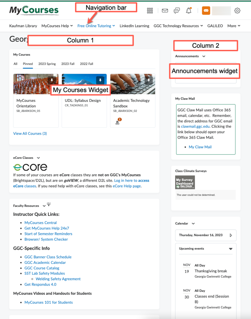
When the main homepage is viewed on a smaller screen, the first column and all of its widgets are displayed first then the second column and all of its widgets. This means with the current homepage, the announcements widget appears below the Search Library Resources widget making it difficult for faculty and students using a mobile device to view announcements.
Some support resources were found in both the navigation bar and within a widget, some links and widgets are no longer recommended by areas such as the Kaufman Library, and others are just out-dated.
Homepage Options and Navigation Bar Enhancements
Additional details and screenshots of each homepage option and navigation bar enhancements can be found in the MyCourses Main Homepage and Navigation Bar Visuals guide. The guide includes screenshots from different roles including faculty and students as well as examples of the. mobile experience. A summary is available below.
Join a Webinar
You may join IT for a webinar, Updating the MyCourses Main Homepage Experience, on February 13 at 2:00p via Zoom.
Option 1
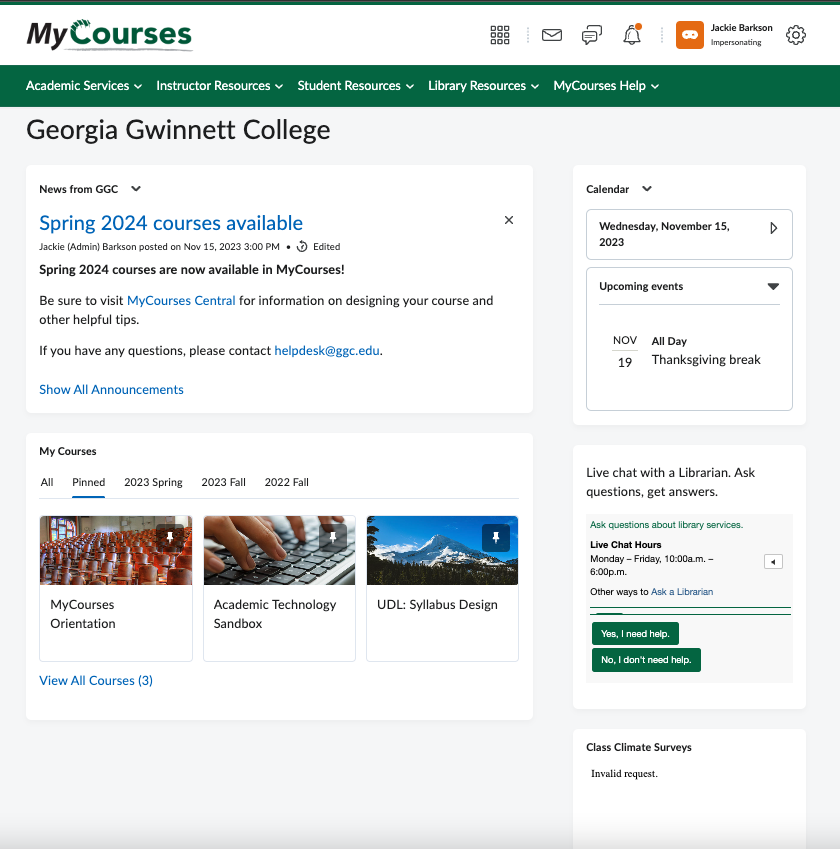
Main Homepage Option 1 offers several enhancements including:
- Adding a GGC green color theme to the Navigation Bar for better visibility.
- Removal of the excess widgets and consolidation of the necessary resource links to the navigation bar for easier access and improved mobile experience.
- Relocation of the Announcements widget to the larger left panel for important messages to be displayed first when viewing on mobile devices.
- Renaming the Announcements widget “News from GGC” to help differentiate it from course announcements. This custom name will only be displayed on the MyCourses Main Homepage. Notifications from the Brightspace Pulse app will still be labeled as “Announcements”.
Option 2
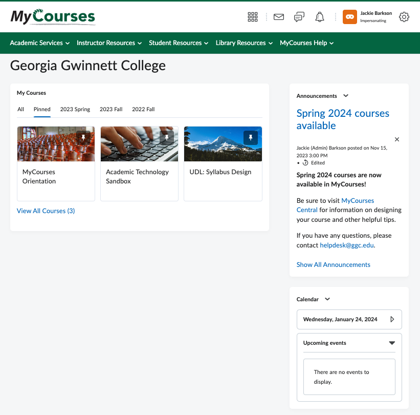
Main Homepage Option 2 offers several enhancements including:
- Adding GGC green color theme to the Navigation Bar for better visibility.
- Removal of excess widgets and consolidation of the necessary resource links to the navigation bar for easier access and improved mobile experience.
- Announcements widget remains on the right panel resulting in the MyCourses ‘course’ widget being displayed first when viewing on a mobile device.
Navigation Bar
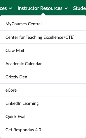
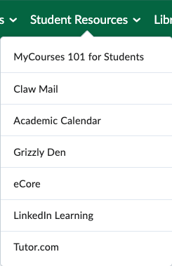
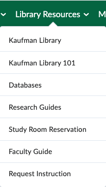
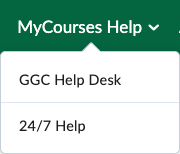
The navigation bar includes the following key changes:
- Relocating many links that were previously found in widgets to the navigation bar.
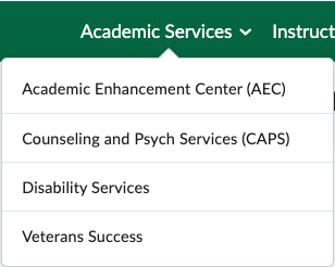
- Establishing “link groups” to group related resources together and improve the mobile experience.
The navigation bar’s “link groups” are listed below as well as a sampling of the links that would be found in each “link group”
Timeline
IT expects to make changes to the MyCourse Main Homepage experience in time for the start of the Summer 2024 semester. The timeline for making this transition is as follows:
- February 12, 2024-March 1, 2024
- Solicit faculty input on main homepage options and navigation bar
- March 2024
- Based on faculty input, finalize main homepage and navigation bar
- May 2024
- Apply changes to main homepage and navigation bar after spring semester final exams
- May 2024-July 2024
- Update support materials to reflect the main homepage options and navigation bar
Next Steps
Faculty should review the navigation options and provide their input via the MyCourses Main Homepage Experience Survey by March 1, 2024.
