
During Fall 2025, Panorama identified common accessibility issues found in Microsoft Word documents, PowerPoint presentations, and Excel spreadsheets used in MyCourses courses. Many of these issues can be identified and corrected by using Microsoft’s Accessibility Checker prior to adding content to MyCourses.
The following digital accessibility concerns fall under three major categories: color, multimedia, and structure.
Common Accessibility Concerns with Microsoft Content
Color
Color Used to Convey Meaning
Color cannot be used as the only way to communicate messages or meaning. When you use color to add emphasis to text, consider using an additional visual effect such as bold, italics, or underline.
Note the difference in the following examples:
Inaccessible
All students are required to take the final exam using Respondus LockDown Browser.
More Accessible
All students are required to take the final exam using Respondus LockDown Browser.
Lack of Color Contrast
Color contrast is the difference in color between a foreground element (like text) and the background. Color contrast is a requirement for digital accessibility.
In practice, test lighter and darker colors together. Try different color combinations with WebAIM’s Color Contrast Tool, which calculates the contrast ratio and determines if the combination passes accessibility requirements.
Consider the following examples of color contrast:
High Contrast
The five boxing wizards jump quickly.
The five boxing wizards jump quickly.
The five boxing wizards jump quickly.
Low Contrast
The five boxing wizards jump quickly.
The five boxing wizards jump quickly.
The five boxing wizards jump quickly.
For learners without visual impairments, all of the low contrast examples may seem acceptable. However, the third low contrast color combination of white and yellow is notoriously unacceptable.
Multimedia
No Alternative Text for Images, Charts, and Tables
Alternative text, also known as alt text, describes the content and purpose of the image, chart, or table for people who have visual impairments or use screen reading technologies to interact with digital content.
All images, charts, and tables need some form of alt text. The alt text should provide the information a person needs to know about the image, chart, or table to make it relevant to the content. A table or chart may need a more detailed description than an image.
If a visual element does not convey important meaning or add value to the related content, Microsoft Office applications allow you to mark it as “decorative.” This will disable the alt text feature for that element, and it will be skipped by screen readers.
Review the following video from Section508.gov for guidance on specific examples (logos, screenshots, etc.), AI-generated alt text, and how to work with alt text in Microsoft Word.
Images Containing Text
Images containing text should be avoided where possible. A more accessible design decision would be typing the text in the document containing the image. However, when this is not a viable option, alt text should contain the image’s text content word for word.

Tables Do Not Include Headers
When tables are used to present data, formatting that indicates the relationship between a header cell and data cell must be present. It is also important to provide a caption and/or summary that identifies and describes the purpose of the table. There are specific formatting options that must be applied to tables to indicate which cells include headings. It is not enough to simply bold text within a cell in an attempt to visually create a header cell. The same is true for adding a caption or summary.
In the following screenshots, we are creating a table in Excel. As of now, the bold cells are strictly visual. There is no difference between bold and normal cells yet. There is a checkbox for “My table has headers” in the Create Table pop-up window of the screenshot. Unchecking this box will result in a table that has no headers. Cells will not be deleted, but there will be no set header row.

Now that the table has been created with headers, there is a visual and functional difference between the first and following rows.

Structure
Formatting Text to Look Like Headings
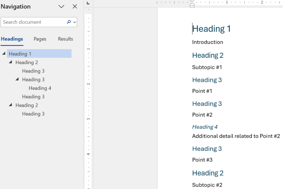
Increasing text size or adding bold formatting to simulate the look of headings is a common but inaccessible practice used by many content creators. This practice results in the appearance of a heading in a document but does not create a true document structure indicating content relationships. It also makes it difficult to create a navigational structure allowing readers to move to specific sections of the document. People using screen readers require documents that have headings created by using specific heading styles.
Microsoft Office applications like Word, PowerPoint, and OneNote support a “Styles” feature that visually changes the appearance of text content while adding functionality that improves structure and navigation for all users.

Using the Styles feature in Word automatically creates a navigation structure.
Posting Links with Long URLs
Many links are long and use a random string of characters that are difficult to read and remember. People who rely on screen reading technologies will not want to listen to the reading of a URL that contains random characters. Content creators should create hyperlinks that use descriptive text rather than simply pasting a URL into a document. The descriptive text should be more descriptive than “click here”, “learn more”, or “read more.”
Compare the following examples:
For more information, click here.
All of these examples lead to the same webpage, but they steadily become less informative. Hyperlinks should be descriptive and meaningful.
Upcoming Workshops
Information Technology is hosting a series of workshops on digital accessibility from a variety of topics for any GGC faculty, staff, or students who would like more information or instruction on how to get started making or editing their digital content.
Accessibility Tips: Microsoft PowerPoint
Tuesday, February 10, 2026 (2 p.m. – 3 p.m.)
Accessibility Tips: Microsoft Office
Tuesday, February 24, 2026 (2 p.m. – 3 p.m.)
Need to learn more?
Need to learn more about MyCourses, Zoom, Microsoft software, Accessibility, or Classroom Technology?
Check the IT Workshop Schedule – OR- Schedule a 1-1 Consultation